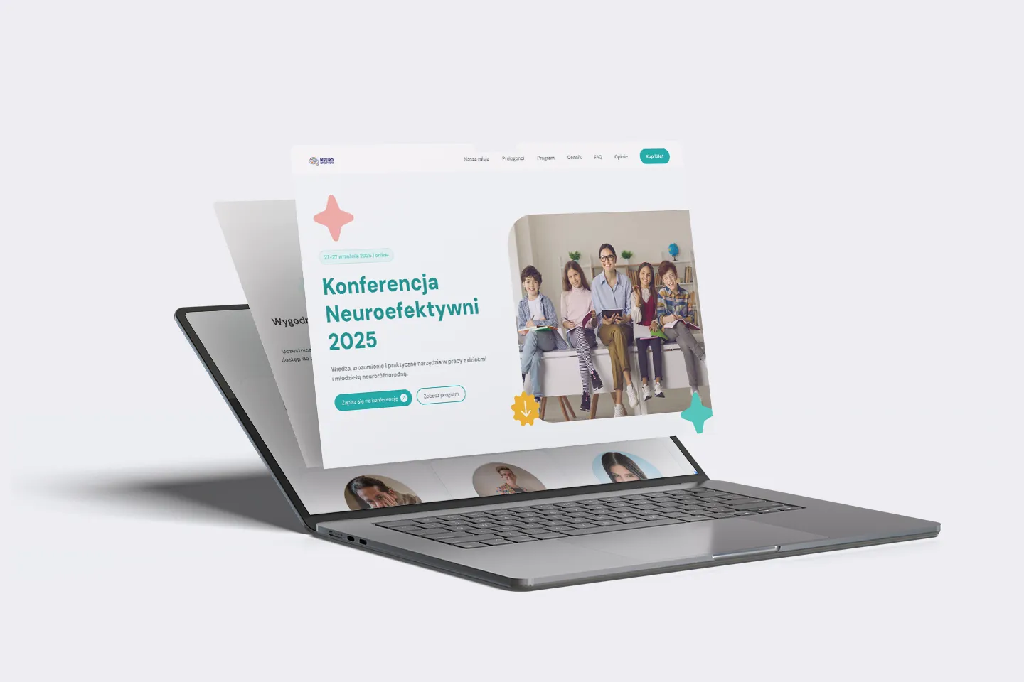
A scalable landing page designed for clarity, growth and long-term use
Supporting a content-heavy conference with a calm, structured and future-ready Webflow system.
Starting point
NeuroEfektywni reached a stage of growth where clarity and scalability became essential.
As the conference evolved and the amount of content increased, the team needed a structure that could support future editions — without adding complexity.
This wasn’t a redesign for the sake of change, but a step toward a clear, repeatable foundation built to grow with the event.
Project Scope
UX/UI
Interaction design
Webflow Development
Content & system structure
The Approach
A structured approach, not just a landing page
The project started with structure. Before moving into visuals, the focus was on content hierarchy and flow — ensuring complex information could be absorbed calmly and predictably by both users and editors.
SYSTEM & SCALABILITY
Designed to grow with the event
From the beginning, the landing page was treated as a repeatable system rather than a one-off design. The structure was intentionally built to support future conference editions without increasing complexity.
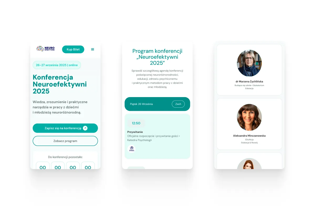
Content was organized into modular sections and predictable patterns, allowing the page to expand as the event evolved. This approach ensured consistency across editions while keeping the experience clear and manageable for both users and the internal team.
The system allows the team to:
manage speakers and schedules independently
reuse sections across future conference editions
maintain consistency as the amount of content grows
stay in control without relying on constant design changes
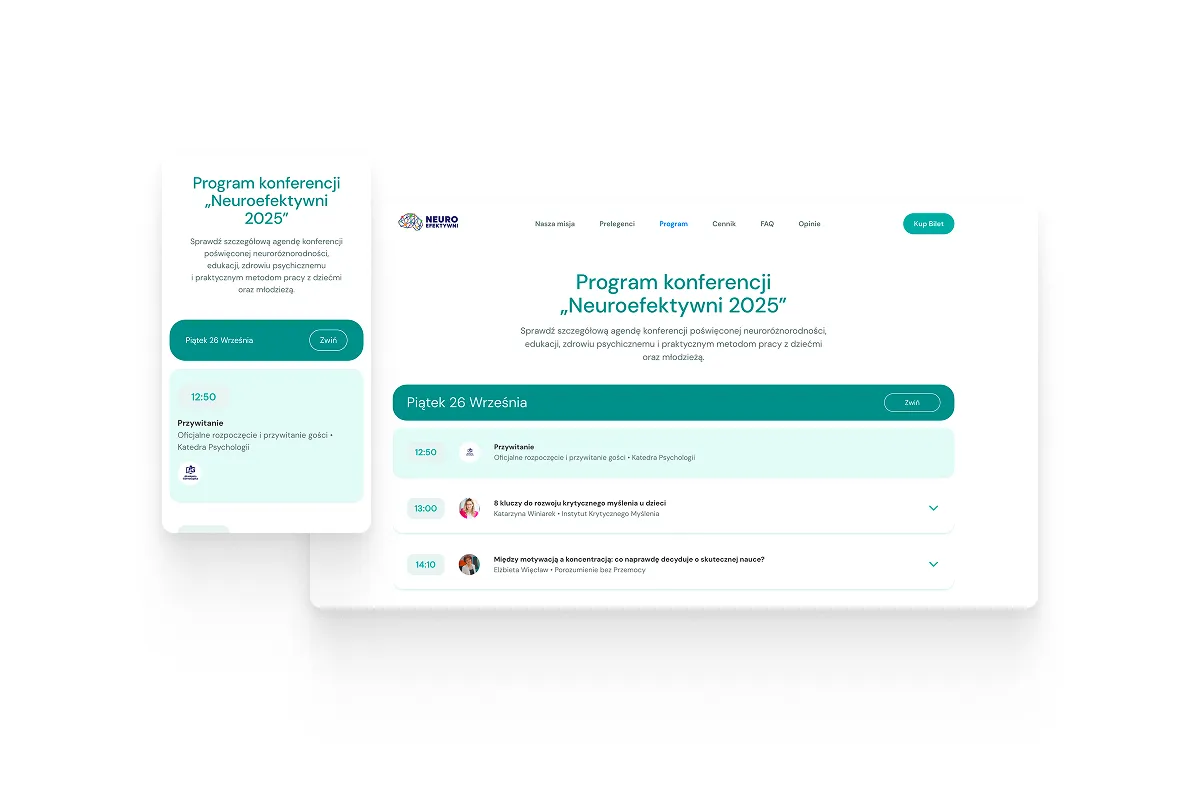
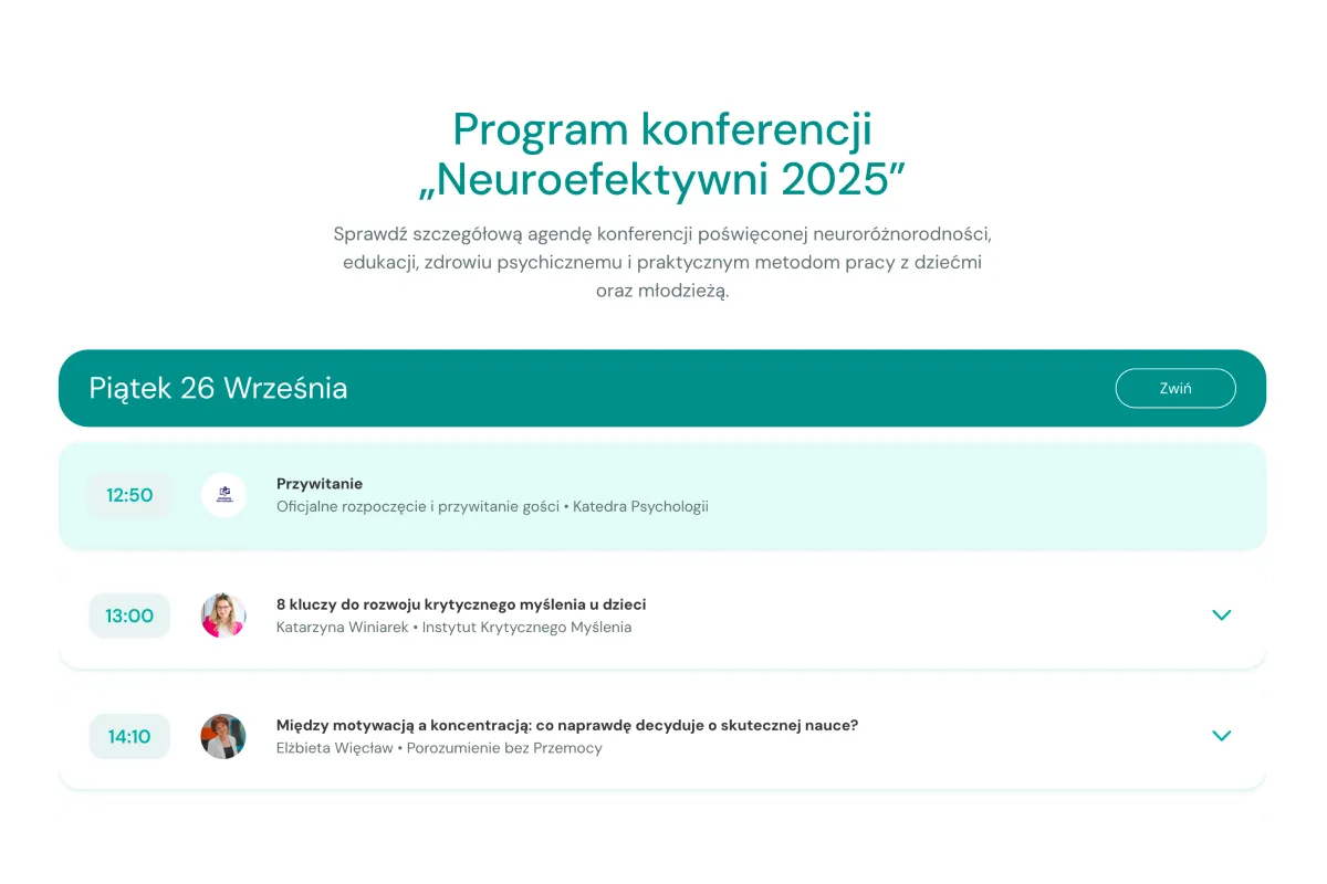
The landing page needed to support a large amount of content without overwhelming the user. Clear hierarchy, predictable patterns and content chunking were used to reduce cognitive load and support quick scanning across the page.
Process
From content strategy to a scalable Webflow implementation
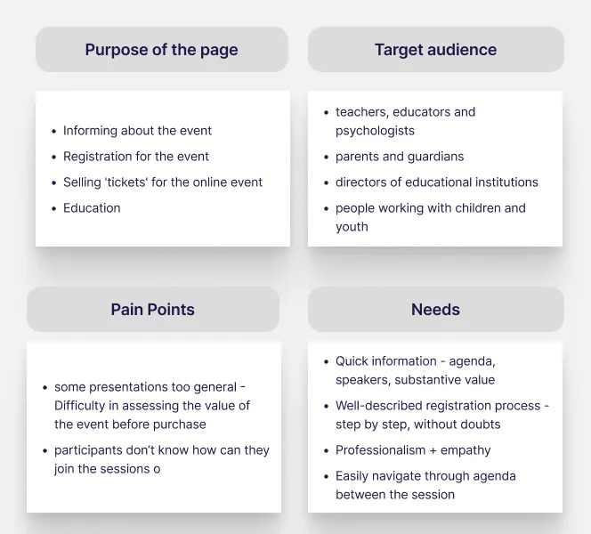
Understanding content and user needs
The process started with identifying key user questions and mapping the volume, complexity and priorities of conference content.
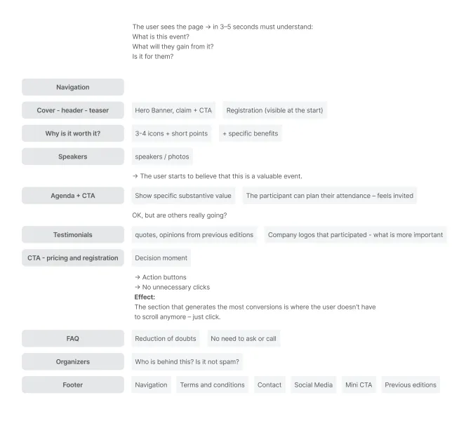
Defining structure and information hierarchy
Content was organized into clear sections with a predictable order, allowing users to quickly understand the event and navigate a long-form page with confidence.
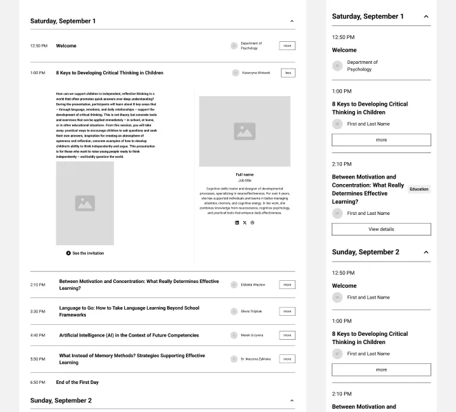
Low-fidelity layouts and content-first wireframes
Low-fidelity wireframes were used to validate structure, hierarchy and section order — focusing on clarity, flow and content logic before visual design decisions.
High-fidelity views and visual hierarchy
High-fidelity designs translated the approved structure into a calm, readable interface, reinforcing hierarchy, scannability and trust without adding visual noise.
Webflow implementation, testing and long-term scalability
A modular, CMS-driven Webflow build designed to scale, adapt and stay usable long after launch.
UI & visual design
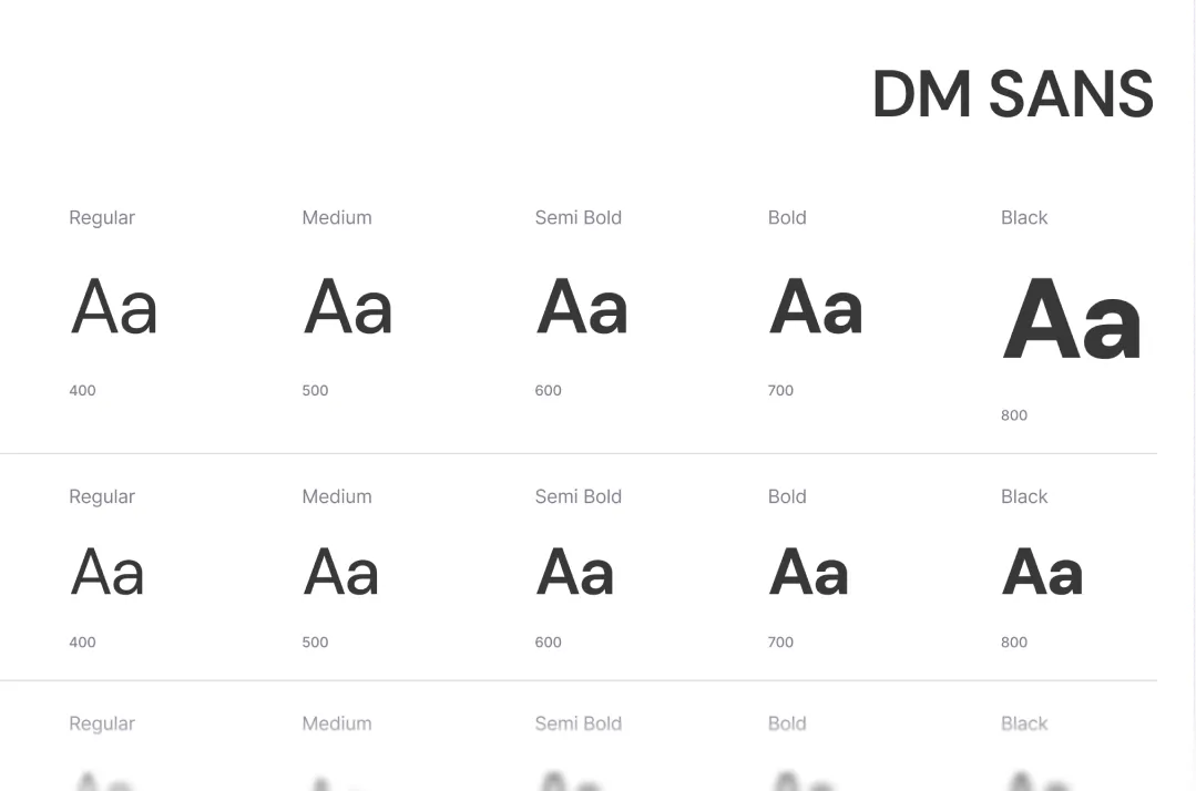
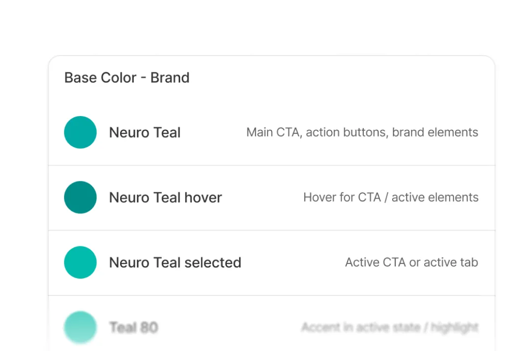
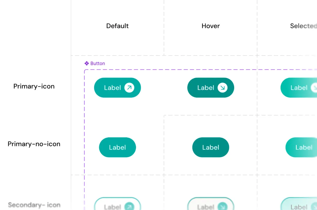
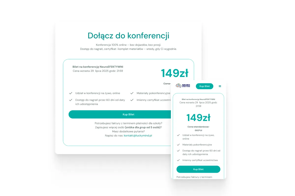
Visual system built for consistency
The visual layer was designed to reinforce structure and readability rather than compete with content. A lightweight design system ensured consistency across layouts while remaining flexible for future extensions.
From design to build
Translating structure into a maintainable Webflow build
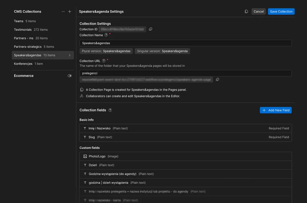
The final stage focused on translating the system into a functional Webflow build. Beyond CMS structure, the implementation included editable, reusable components designed to make future updates simple and safe.
The goal was to allow the team to build and adjust pages confidently, without breaking layout consistency or relying on ongoing designer support.
The Webflow build enables the team to:
manage speakers, agenda and sessions through structured content types
update and expand content without affecting layout integrity
reuse sections and patterns across future conference editions
maintain consistency without ongoing designer or developer support
Outcome
A foundation built to evolve
The result is a calm, content-first conference website that remains clear despite complexity — and flexible enough to grow with future editions.
The implementation followed a CMS-first approach, ensuring that content structure, relationships and editing logic remained consistent with the original system design.
Clear structure and predictable flows make it easy to understand the event, scan the agenda and make confident decisions without friction.
A modular system and CMS-first build allow the team to manage speakers, schedules and updates independently — without ongoing design or development support.
The website now serves as a repeatable foundation that can be reused and adapted for future conference editions without redesigning from scratch.
Selected views
This project reinforced the importance of designing structure before aesthetics — especially for content-heavy, evolving products.