Redesigning a content-driven website for an educational brand
A structured redesign and Webflow implementation for a marketing website supporting course promotion, SEO continuity and long-term content growth.
Starting point
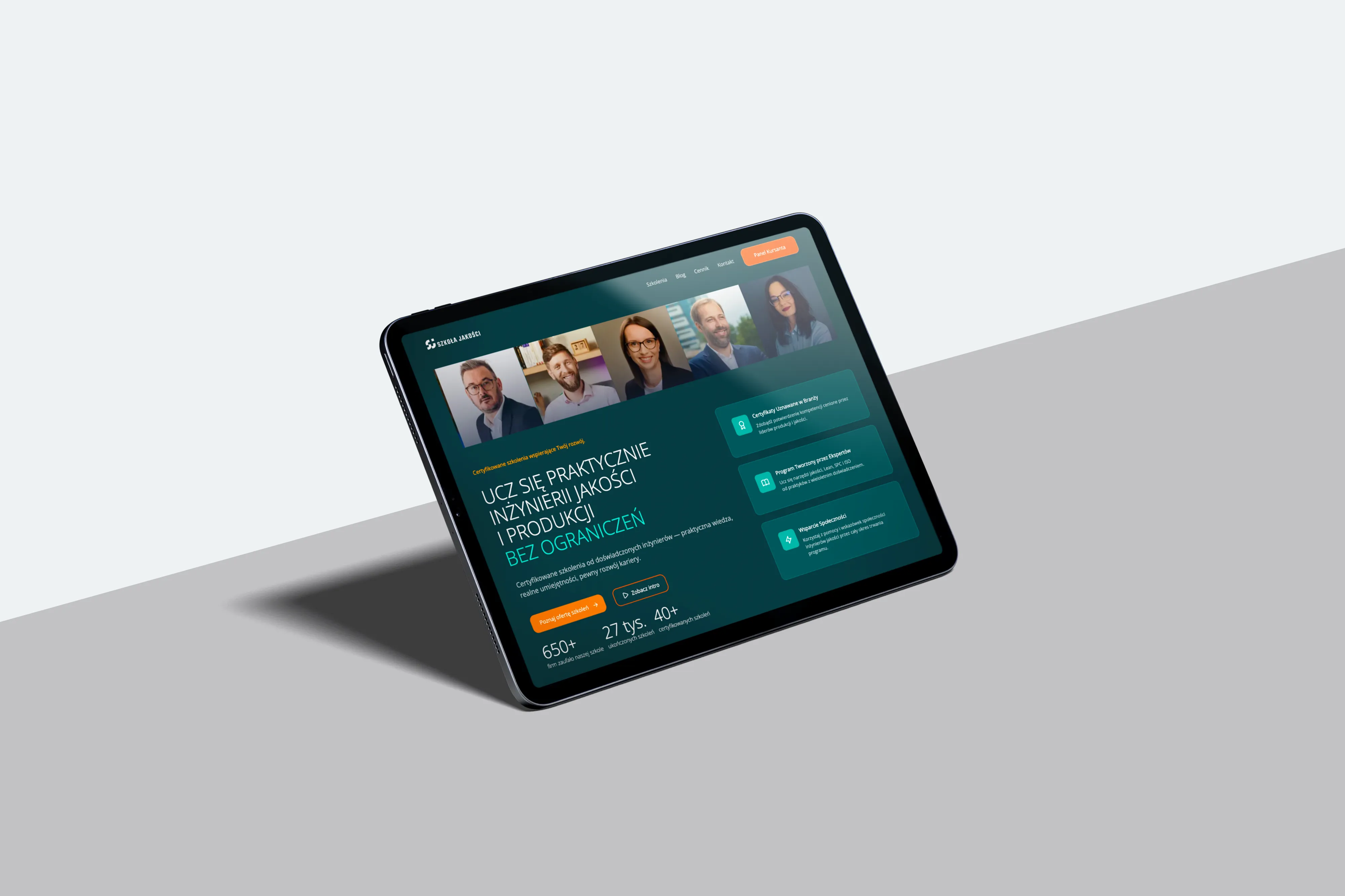
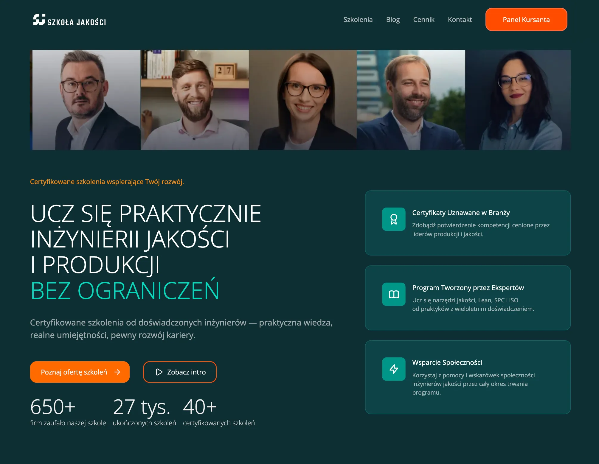
Redesigning an existing educational website without losing visibility or clarity
The project started with an existing educational website that required a visual and structural refresh — while preserving its role as a key entry point for courses and training offers.
Beyond updating the look and feel, the redesign needed to carefully address SEO continuity. This included mapping high-traffic pages, planning redirects and introducing a new page framework without disrupting existing content performance or user expectations.
Project Scope
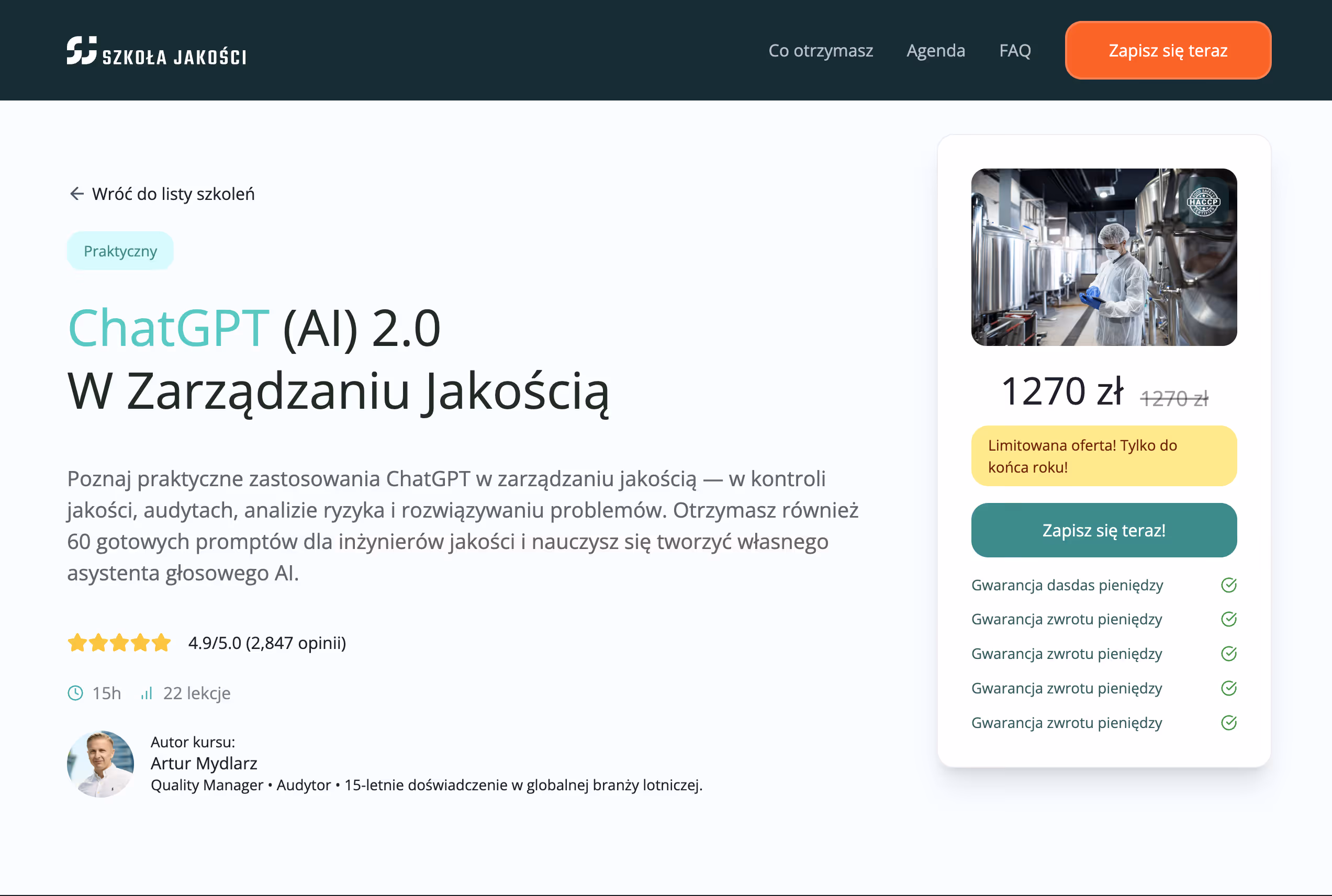
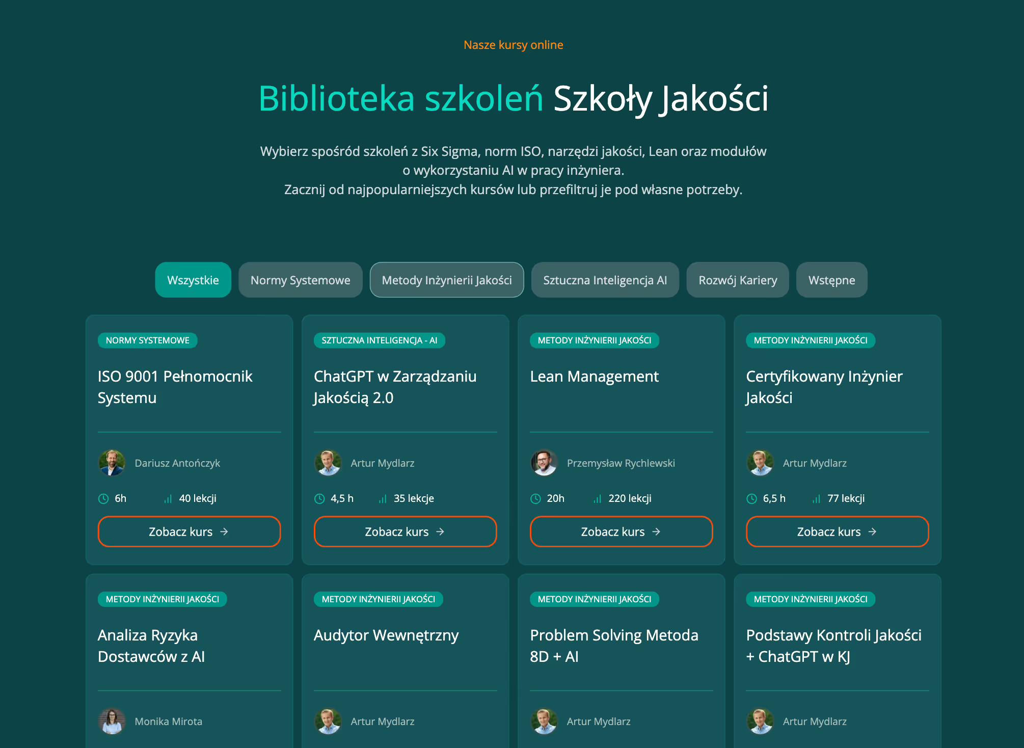
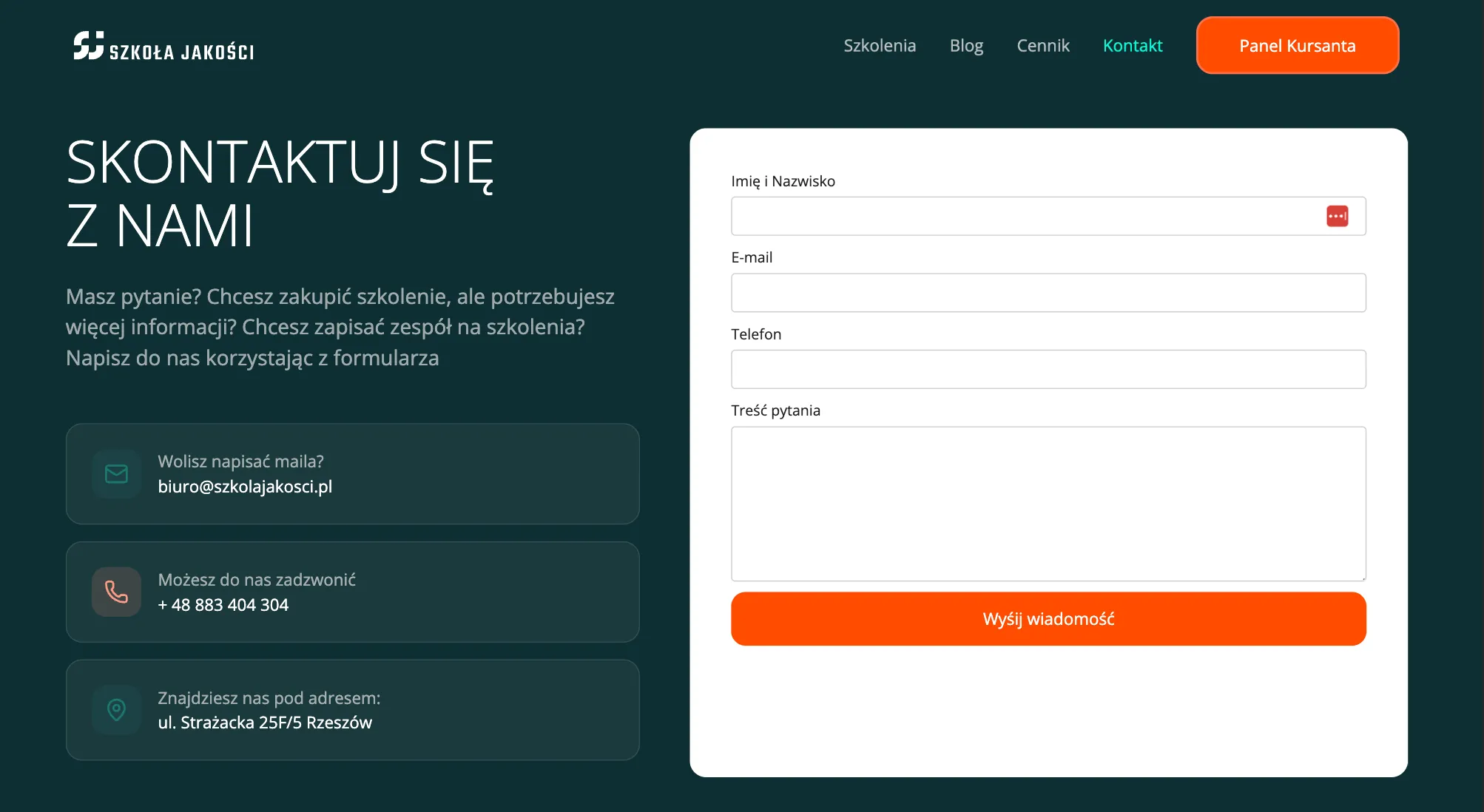
Website redesign (home page, landing pages, course pages)
Webflow implementation using a reusable page framework
UX decisions based on user session recordings and pain points
SEO migration support (redirects, traffic-critical pages)
SEO-aware information architecture and page mapping
The Approach
Designing and rebuilding a content-heavy website with trust and continuity
The redesign was approached as a carefully guided transition, rather than a full exploratory UX process — with early validation of key views, structure and interaction patterns, followed by direct implementation in Webflow.
The redesign was approached as a carefully guided transition, rather than a full exploratory UX process — with early validation of key views, structure and interaction patterns, followed by direct implementation in Webflow.
Design decisions were informed by real user behavior, based on session recordings and observed pain points
The approach balanced visual refresh with structural clarity and SEO continuity, ensuring the new website supported existing traffic while introducing a clearer, more maintainable framework.
SYSTEM & SCALABILITY
A reusable website structure designed to grow with the course offering
The redesign focused on creating a clear, template-based framework that allows new course pages to be added gradually — without reworking layouts or navigation.
The website was designed as a reusable structure rather than a one-off set of pages. Course pages, landing pages and listings follow the same layout logic and navigation patterns, making it easy to introduce new content while keeping the experience predictable and coherent.This approach allows the client to expand the course offering independently, without redesigning the website each time, while maintaining clarity, consistency and a clear path toward checkout or the learning platform.
Focusing on high-impact areas, we restructured the site in Webflow without disrupting existing traffic. Our approach ensured a seamless transition that protected SEO rankings and user habits.
Process
A guided redesign with SEO and structure built in from day one
The project followed a focused, execution-oriented process shaped by existing content, real user behavior and SEO requirements defined from the very beginning.Instead of a full exploratory UX phase, decisions were validated early and translated directly into a Webflow build.
Understanding the existing ecosystem and search landscape
The work started with an analysis of the current website, content structure and SEO foundations. Key entry points, high-traffic pages and existing user paths were identified to ensure the redesign would preserve visibility and support established behavior.
User pain points informed by real sessions
Design decisions were informed by user session recordings and observed friction points — including navigation confusion, unclear click targets, rage clicks and difficulties returning to course listings.
These insights directly shaped interaction patterns and page layouts
Defining key views and structural decisions
Rather than designing every possible screen, the focus was placed on defining core page types — homepage, landing pages and course templates.Structure, hierarchy and interactions were designed to support both intuitive navigation and SEO-friendly content expansion.
SEO-safe transition and content mapping
URL structure, redirects and page relationships were planned alongside design decisions.This ensured continuity of search performance while introducing a new framework that could scale with future courses.
Direct Webflow implementation
Once key views were approved, the design was translated directly into Webflow. Reusable templates and components were built to allow the client to gradually expand content independently — without breaking structure, navigation or SEO logic.
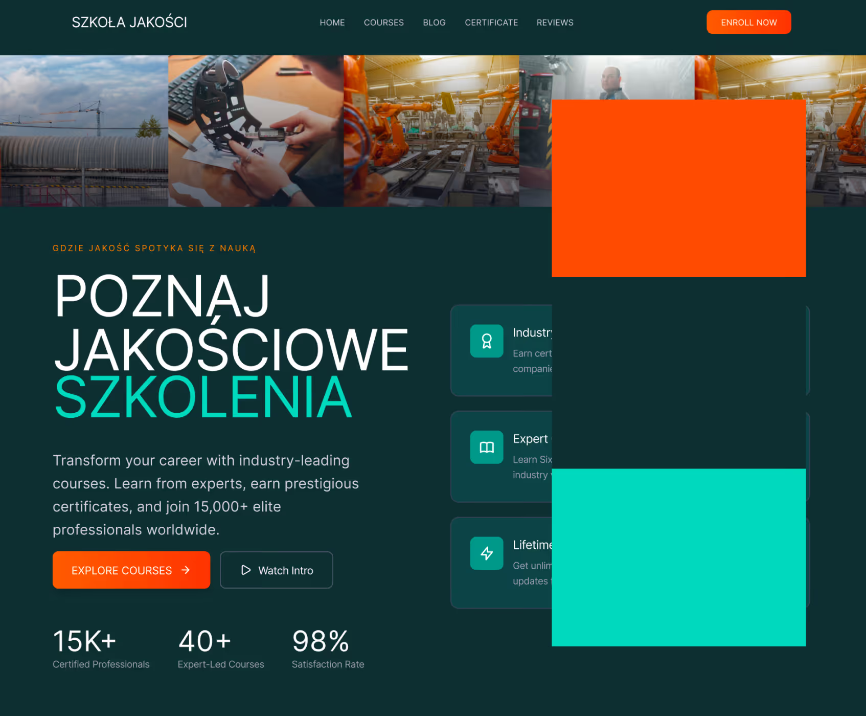
UI & visual design
A visual refinement aligned with the brand’s evolution
The redesign reflected the natural evolution of the company rather than a change in brand foundations.The existing color palette and typography were intentionally preserved, while the overall visual character of the website was refined to better match the brand’s current maturity and positioning.
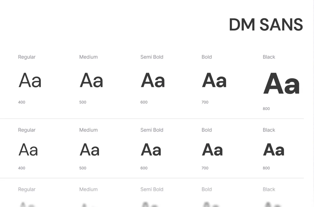
A limited type scale with clear weight hierarchy supports readability across a content-heavy page.
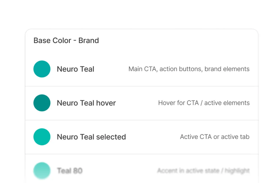
A limited type scale with clear weight hierarchy supports readability across a content-heavy page.
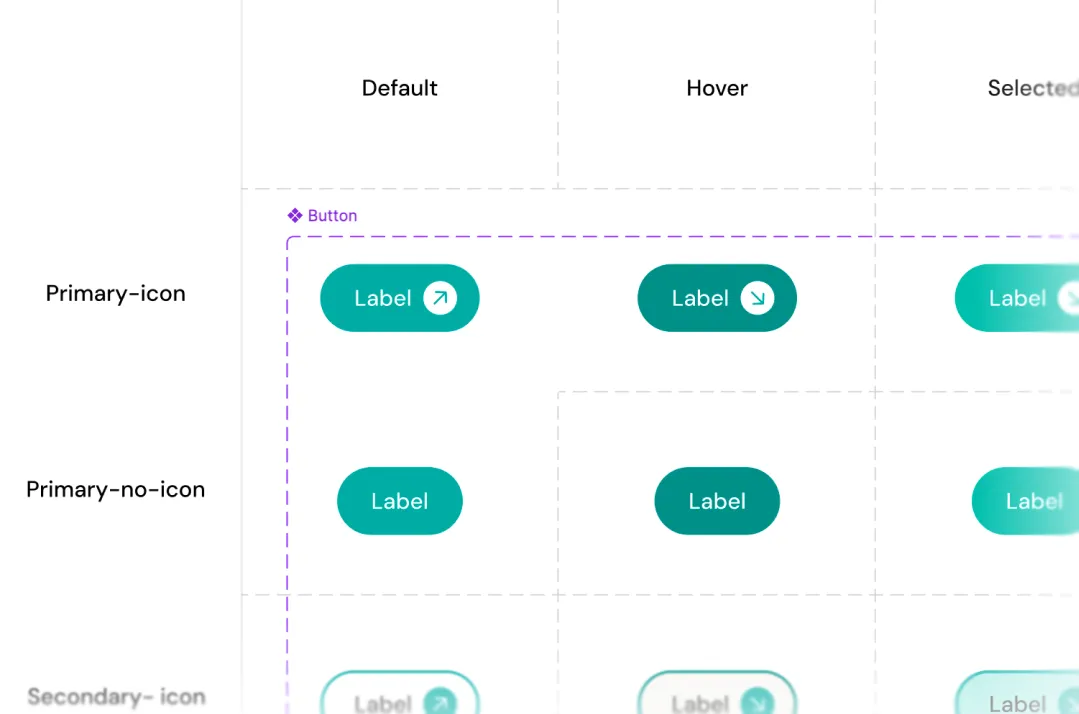
Clear states and variants ensure consistency across sections and reduce decision friction.
From design to build
Translating structure into a maintainable Webflow build
The final stage focused on translating the system into a functional Webflow build. Beyond CMS structure, the implementation included editable, reusable components designed to make future updates simple and safe.
The goal was to allow the team to build and adjust pages confidently, without breaking layout consistency or relying on ongoing designer support.
The Webflow build enables the team to:
manage speakers, agenda and sessions through structured content types
update and expand content without affecting layout integrity
reuse sections and patterns across future conference editions
maintain consistency without ongoing designer or developer support
Outcome
A foundation built to evolve
The result is a calm, content-first conference website that remains clear despite complexity — and flexible enough to grow with future editions.
The implementation followed a CMS-first approach, ensuring that content structure, relationships and editing logic remained consistent with the original system design.
Clear structure and predictable flows make it easy to understand the event, scan the agenda and make confident decisions without friction.
A modular system and CMS-first build allow the team to manage speakers, schedules and updates independently — without ongoing design or development support.
The website now serves as a repeatable foundation that can be reused and adapted for future conference editions without redesigning from scratch.
Selected views
This project highlights that even the most expressive, bold visual identities can support intuitive navigation when structure and hierarchy are designed with intention.